Pantone colors of the year: Rose Quartz and Serenity

At the beginning of every year, the Pantone Color Institute picks a new color that sets the trends in fashion, decor and interior design. For 2016, Pantone surprised everyone with its choice of two colors: Rose Quartz (Pantone code 13-1520) and Serenity (15-3919). The biggest surprise of all was that they paired the two together. According to Pantone, the choice was not random, but an expression of today’s society, where the interest in wellness and relaxation is higher than ever. Good news though – these two picks are versatile hues, in particular when it comes to décor and interior design, and both go well with a wide range of styles, from the most conservative to modern minimalist.
For Pantone, this nomination is a significant shift to the “softer” side, especially when compared to previous years when bold, vibrant colors held the top spot – remember 2014’s Radiant Orchid, 2013’s Emerald or 2012 ‘s Tangerine Tango?
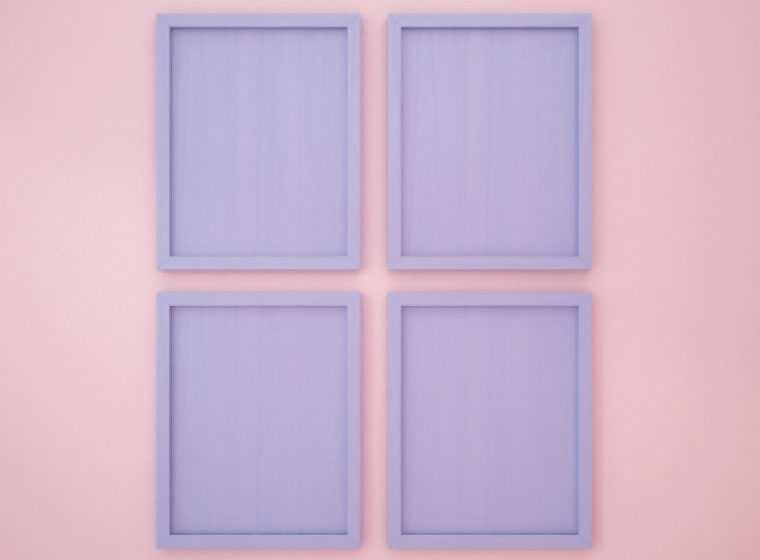
The choice of the 2016 colors is, of course, symbolic. As explained by Pantone, it is an attempt to reflect the moods of today’s consumers, who are more than ever in search of life balance, calm and well-being. The pairing of Rose Quartz and Serenity, commonly known as pale pink and baby blue, exudes calm and relaxation, like an antidote for the modern-day hectic lifestyles.
The 2016 colors balance and complement each other in a less traditional way, but blend beautifully, revealing a soft transition from the warm, gentle tone of the Rose Quartz to the cool and soothing Serenity blue. Individually, Rose Quartz conveys reassurance, warmth and positivity, while Serenity, associated with the blue sky above, is a reminder of relaxation and calm.

When it comes to interior design, these softer tones are more likely to be accepted into homes, and are also easier to pair with a wide variety of colors. Pantone recommends pairing Rose Quartz and Serenity with mid-tones like greens, purples and rich browns, and gives a green light to pairings with all shades of yellow or pink. The best neutrals to complement the duo are cool tones of gray. If you are adventurous, go ahead and use hot brights as accents and add sparkle with silver combinations. For more combination ideas, head over to www.pantone.com.
Adding Rose Quartz and Serenity blue to your home will produce a calming and refreshing effect. In many instances, these colors, alone or in combination, are great for conservative tastes. They are also excellent choices for antique aesthetics and children’s rooms. If you choose to explore the full potential of the two colors and their combination, don’t be afraid to incorporate them in every room of your home: Rose Quartz and Serenity are ideal for day rooms and generally small spaces, creating the illusion of a larger, airy space, while still being able to keep that cozy feeling.

But it doesn’t have to be all about calm and coziness, and this is where their versatility allows for daring experiments. To make it fun, break the rules – combine these colours with bold prints, or simply contrast with blacks and browns. If your style is rather minimalist, associate one of the two colors with other light neutrals. For the ultimate “clean” look, pair with white.
With two colors, the possibilities are endless. It’s just a matter of time until the design and fashion industry respond by incorporating the two colors into their palettes and set the trends for 2016. Of course, you – the consumers – have the last say when it comes to including these colors into your lives. Go with the trend, create your own or wait for a new year.
Any predictions for the color of 2017? Share below!